I spend a lot of time thinking about how we might improve our use of technology. For my prototypes, I utilize Sketch for Mac and Principle, and this time I wanted to share with you my concept of a whole new YouTube experience. Your input is much appreciated. 🙂
I, like many others, spend a lot of time on YouTube. Youtube has been a huge source of fun and information for me throughout the years, whether it’s for music, science, or simply relaxing.
Because it is such a large platform for most of us, I was quite enthusiastic and encouraged to attempt to find better ways to use it.
This is how it goes.
Table of Contents
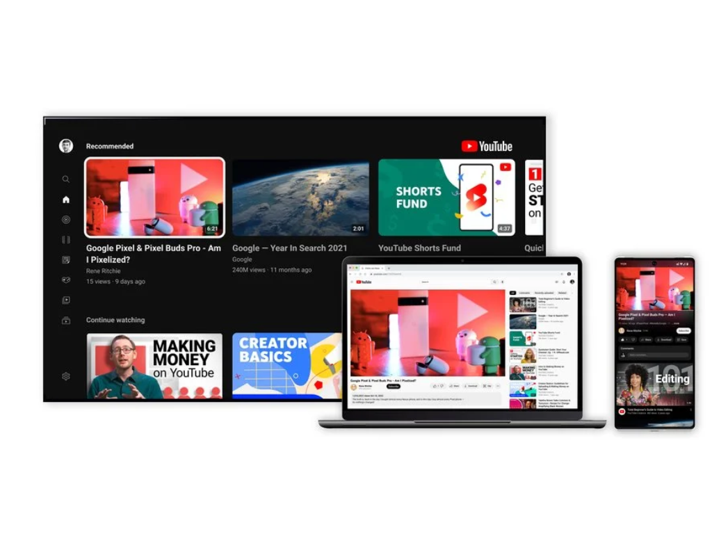
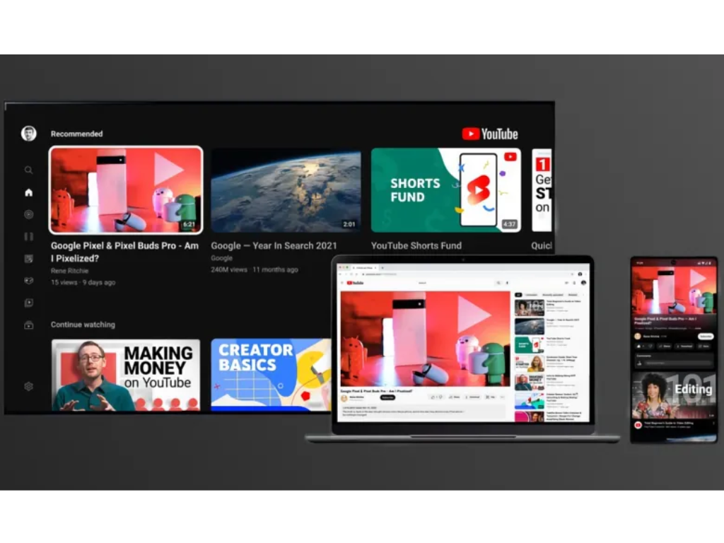
The Home Page
The new Home Page was created with a strong emphasis on suggestions. The first video of the user’s recommendations is playing in the background, but additional videos may play based on where the user moves the mouse.
The background video may be easily stopped or muted, and if the user finds it appealing, they can add it to their “Watch Later” playlist or begin viewing it simply clicking on the video’s title. The video will begin where the preview left off.
By clicking the red play icon next to “My Suggestions,” the user may easily construct a playlist with all of their recommendations. The goal is to establish a trusting connection between the user and YouTube’s Machine Learning algorithms such that their regular experience consists of opening “My Recommendations” and modifying the playlist on the fly.
In addition, the new UI uses a dark mode to accentuate the material and make it easier on the eyes.
Like and Dislike buttons
The Like and Dislike buttons are placed on top of the video player in this concept. And it has a significant impact on how they are used.
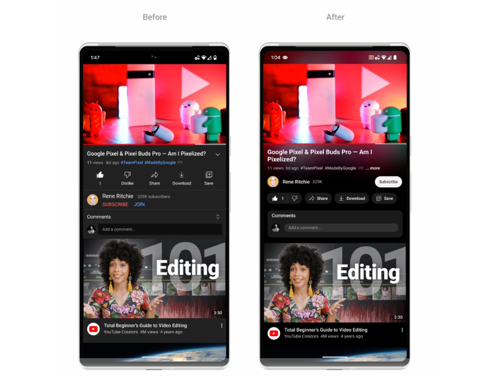
The issue with their present position is that they are not available in fullscreen mode, which is how I prefer to view most of my YouTube videos (and I guess a lot of people do). The worst aspect is that it is really simple, and especially encouraged, to navigate to another movie right from the player. Before the next video begins to play, there is sometimes a counter.
As a result, most of the time I leave the video without like (or disliking) it. It should be avoided since youtubers are not paid for their efforts, and I lost an opportunity as a user to inform Youtube what my preferences were, which might result in less relevant suggestions.
Also Read: Now Keep Conversation From Your Computer Using Snapchat Web
Sometimes I’ll push the Like button before even viewing the video, but this may also be deceptive for the algorithms, and it’s not how the Like/Dislike buttons were intended to function.
By simply placing the Like/Dislike buttons immediately on the player, we ensure that they are clearly accessible throughout the film, particularly towards the conclusion, giving the viewer with a better and more cohesive experience.
The Player
There’s a lot to say about the new video panel because many of the fundamental functions have been fine-tuned to work in tandem with the new orientation.